![]()
![]()
![]()
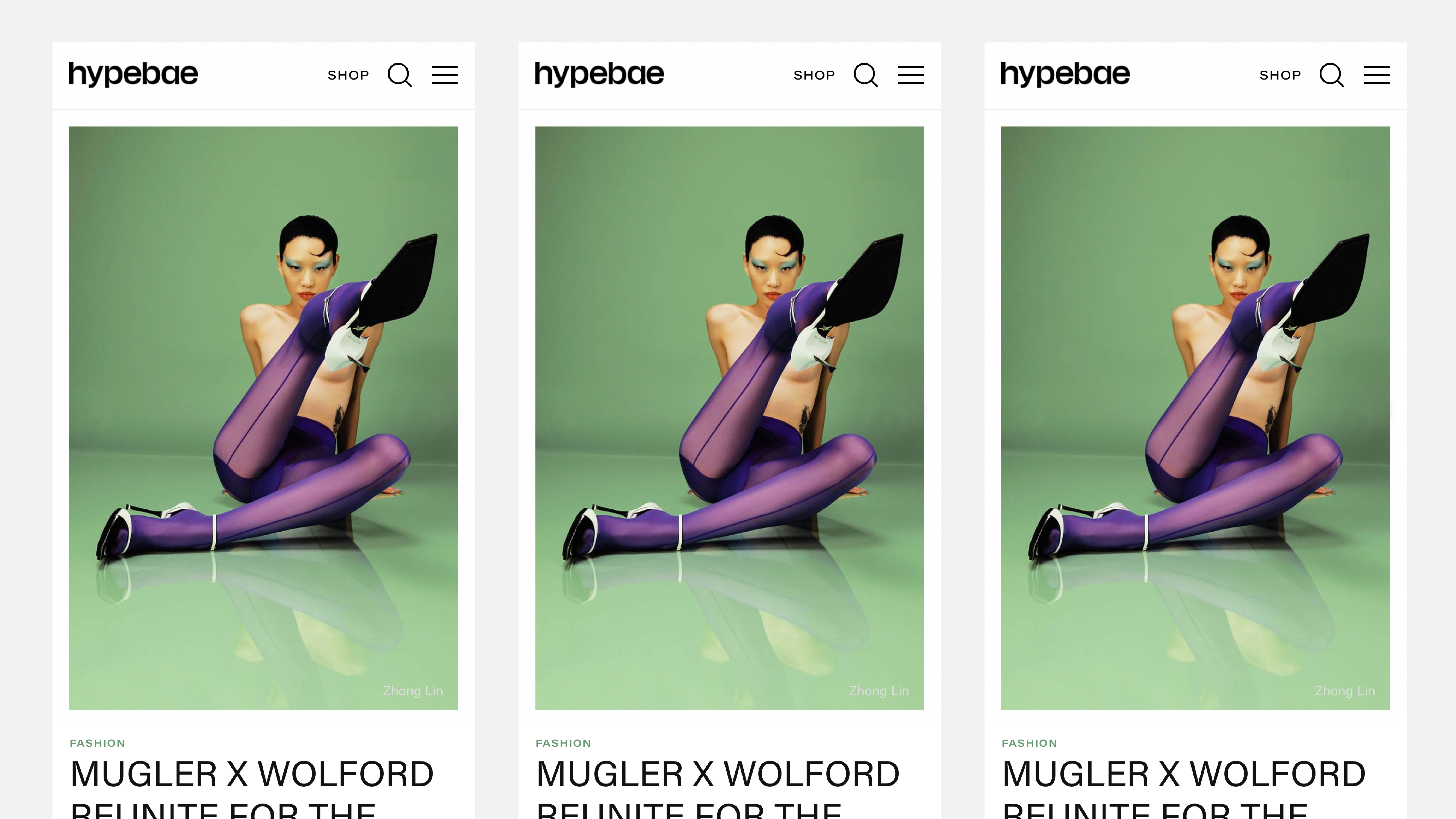
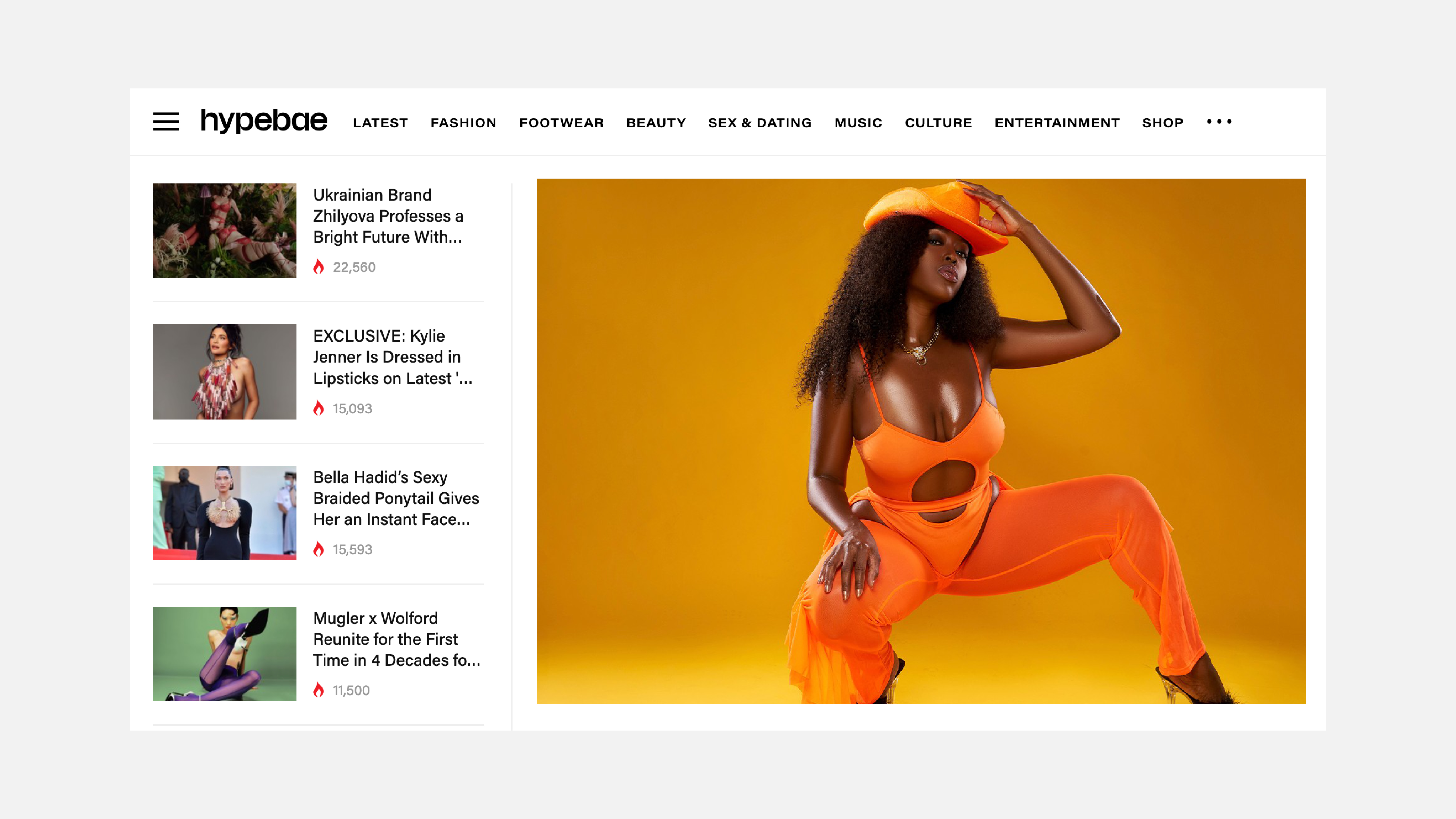
︎︎︎ Studio Marina Veziko redesigned the Hypebae logo, marking the platform’s five-year milestone.
Hypebae is a global editorial platform celebrating women and their stories across fashion, culture, and contemporary lifestyle. Since its launch in 2016, the digital landscape has evolved rapidly, moving from the nostalgic days of instant messaging into an era defined by constant connection, speed, and infinite streams of inspiration.
The new logo takes a refined typographic approach. Set in a clean sans-serif and rendered in lowercase, the mark draws from the language of digital communication, referencing the immediacy and intimacy of messaging culture. The result is a clear, confident wordmark aligned with Hypebae’s forward-looking direction.
︎︎︎ hypebae.com


