BRAND IDENTITY & CREATIVE DIRECTION ︎︎︎ STUDIO MARINA VEZIKO PHOTOGRAPHY & VIDEO ︎︎︎ ALEKSI TIKKALA COPYWRITER ︎︎︎ THOMAS POKORN 3D & ANIMATIONS ︎︎︎ VILLE VAINIO SET DESIGN ︎︎︎ PIIA EMILIA
︎︎︎
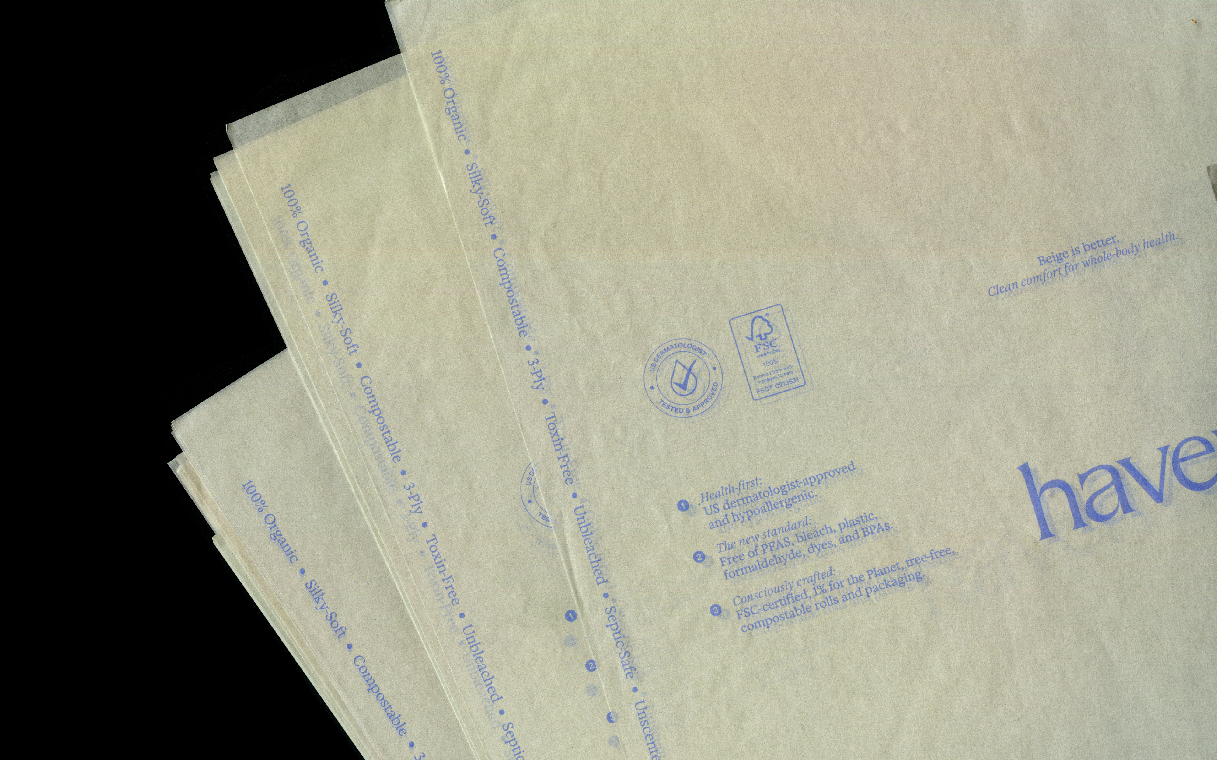
Most toilet paper is an afterthought—bleached, loaded with synthetic additives, and designed purely for function. But for one of the body's most sensitive areas, this can irritate skin and disrupt its natural biome. Haven, a new US-based consumer brand, treats toilet paper with the same care and consideration as skincare. Built on the belief that what you wipe with matters, the brand repositions a mundane essential as a health-first product designed for wellness, not just wiping.
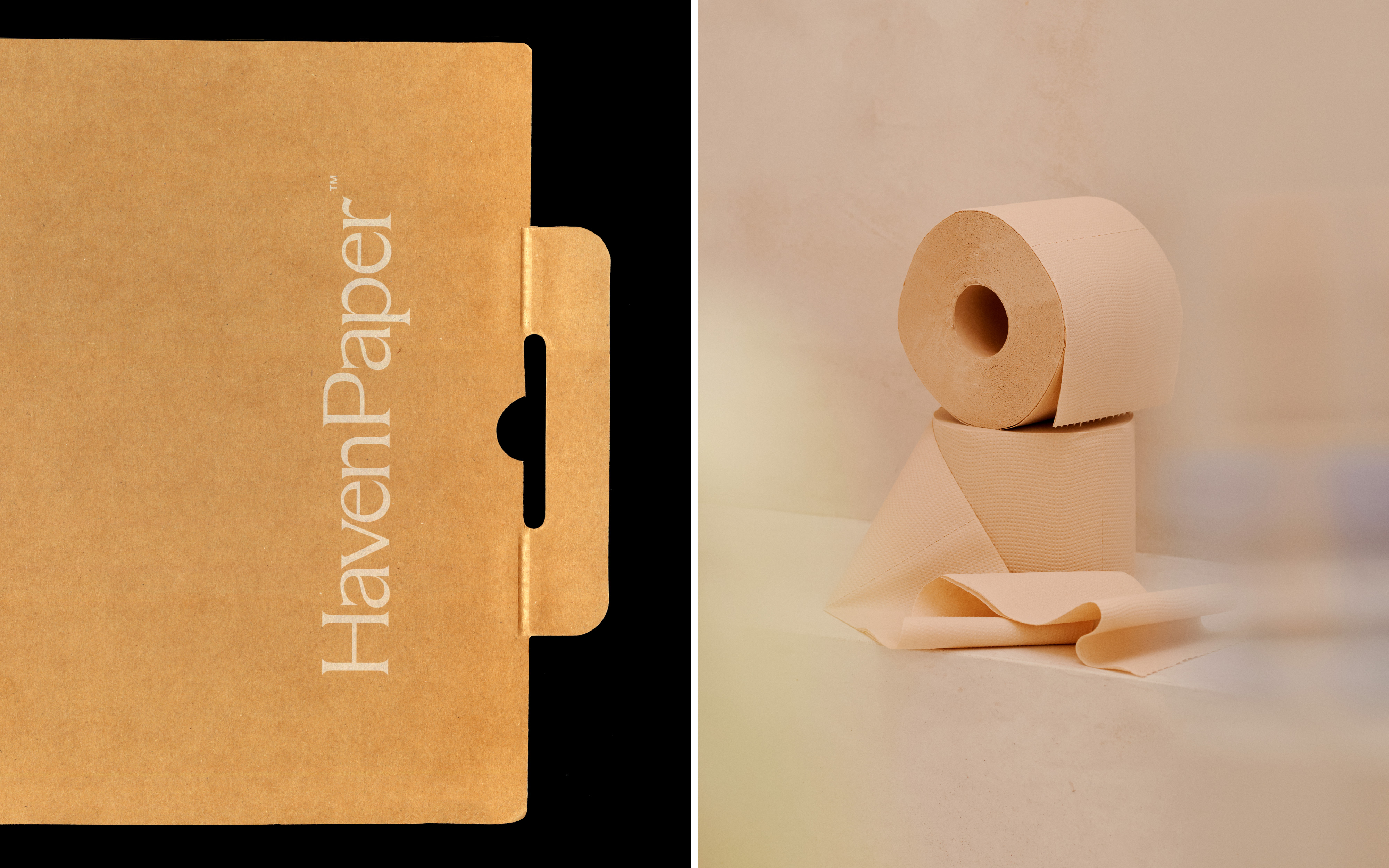
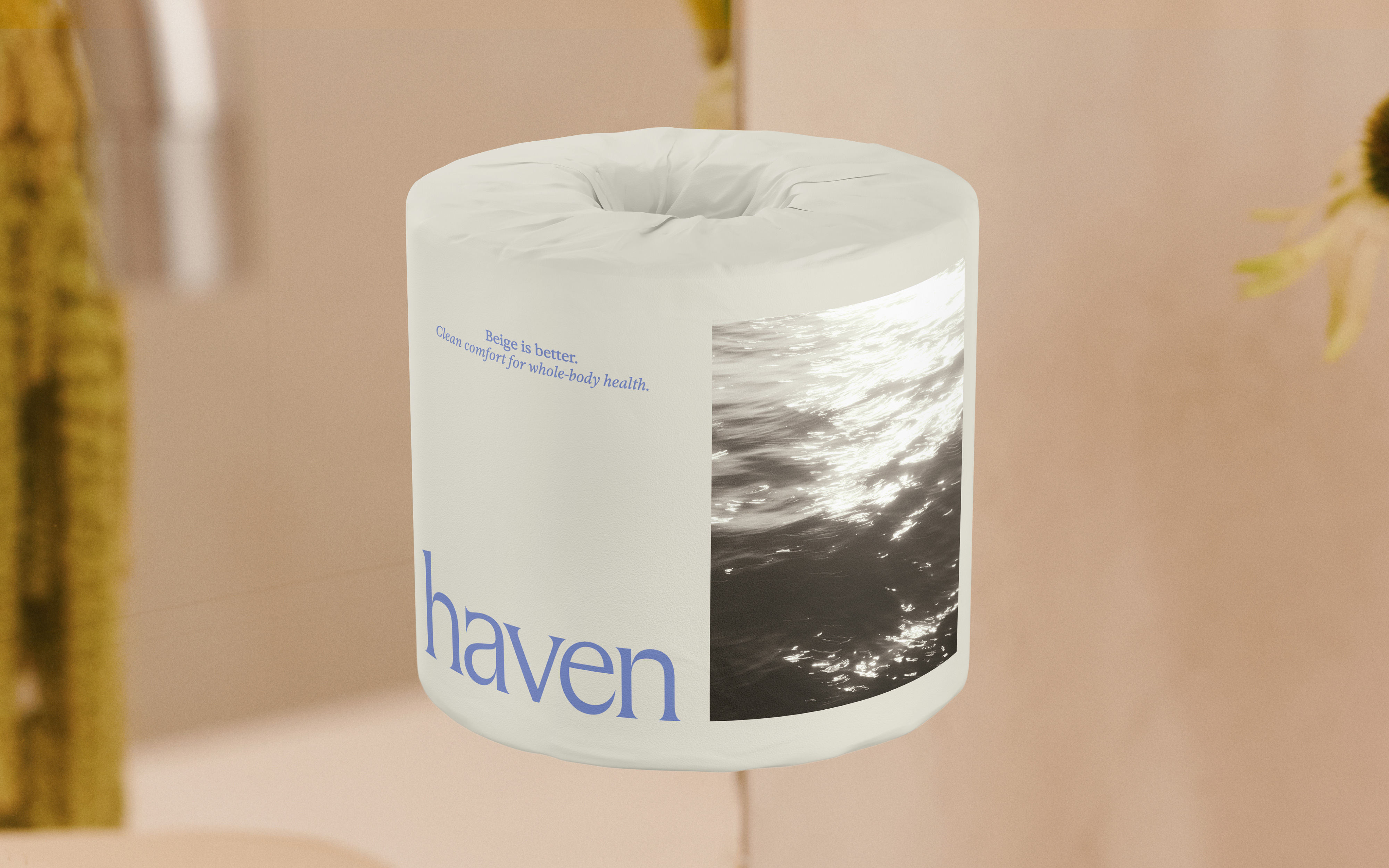
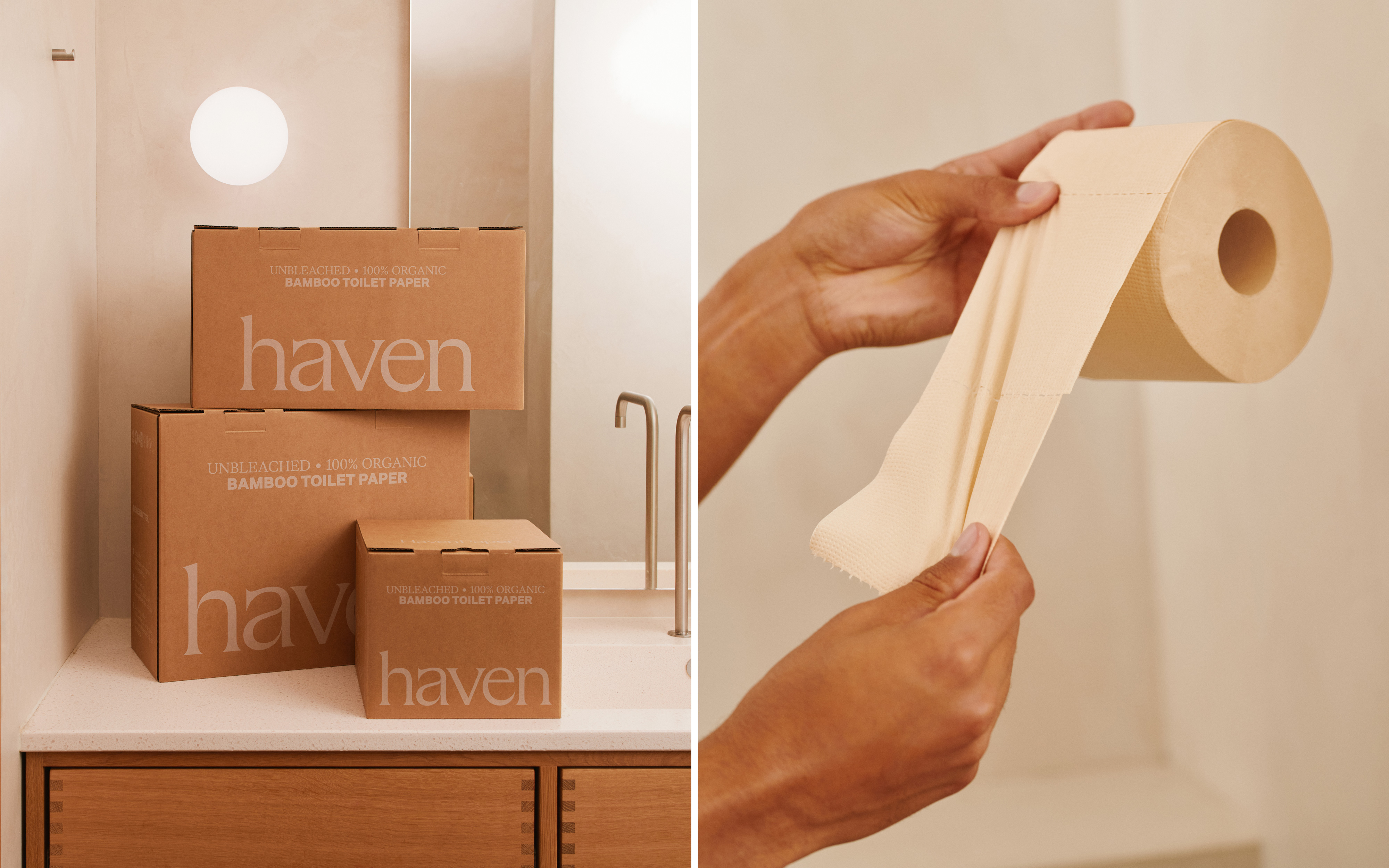
Studio Marina Veziko led the brand identity, packaging system, and overall creative direction, developing a visual language borrowed directly from premium cosmetics rather than household goods. This strategic shift signals a new category standard: toilet paper as body care. A restrained palette of beige and muted natural tones, drawn from Haven's unbleached bamboo paper, counters the conventional assumption that white equals clean while reinforcing the brand's gentle, chemical-free approach.
The studio directed brand photography, film, motion design, and 3D render animations, all adopting the visual vocabulary of high-end skincare. Tactile close-ups and soft, directional light emphasize materiality and calm, creating a confident expression for a product you don't need to hide away. Packaging applications, from natural-colored outer boxes to wrapping and inner tubes, were designed as a cohesive system that reinforces this holistic approach. Toilet paper reimagined with the same standards, attention, and peace of mind you'd expect from any product that touches your body.